Introduction
This week’s article will look at python scripts to generate graphs to measure the total exhaust rate provided in a compartment and gas temperature measured at discrete locations in FDS models.
For this task, I have created two models in FDS:
- Model 1: Containing only volume flow devices
- Model 2: Containing volume flow and temperature measuring devices.
Compared to Model 1, an additional step involving filtering of device data is required in Model 2 to generate the temperature graphs.
Model 1 – Generating Volume Flow Rate Graph
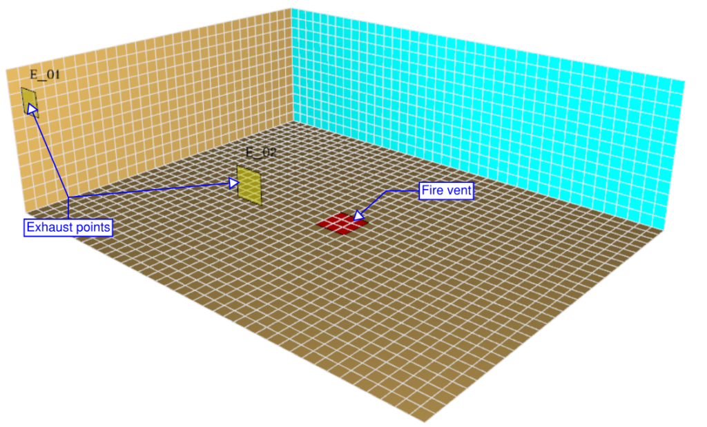
FDS Model
Volume flow measuring devices are available in the FDS to measure the volume flow through openings and flow supply or exhaust vents. In this task, we will generate a graph representing the volume flow rate through two exhaust vents using the CSV file generated by these devices. As mentioned in the previous article, Pandas and Matplotlib can make this task more accessible.
| Parameters # | Value |
| Dimensions | 10 m (length) x 7.75 m (width) x x 3 m (height) |
| Fire size | 1000 kW/m² x 0.5625 m² = 562.5 kW |
| Exhaust points | E_01 – 2 m³/s. Ramp-up time – 20 s t² E_02 – 4 m³/s. Ramp-up time – 40 s t² |
Table 1: Model parameters
Python Script
The python script follows the same methodology we have adopted in the previous article to obtain a clean Dataframe:
- Step 1: Import relevant packages
import pandas as pd
import os
import matplotlib.pyplot as plt- Step 2: Import the csv file into a dataframe using Pandas
df = pd.read_csv(r'C:\OneDrive\JabirJamal.com\Fire Engineering\FE_01\model1\model1_devc.csv')
- Step 3: Rename the column names and reset the dataframe by removing row 0.
# create a copy of the dataframe
df1 = df.copy()

# copy row 0 of df to header of df1
df1.columns=df.iloc[0]

# drop top row
df1=df1[1:].reset_index(drop=True)
df1.head()
- Step 4: Convert the data type to float
df2 = df1.astype(float)
- Step 5: Calculate the total exhaust rate
df2['E_01']=df2['E_01']*-1
df2['E_02']=df2['E_02']*-1

df2['Total']= df2['E_01'] + df2['E_02']
- Step 6: Generate the graph using Pandas plot function and update the legends and axes with Matplotlib function.
# change working directory to the location where you would like to save the image
os.chdir(r'C:\OneDrive\JabirJamal.com\Fire Engineering\FE_01\model1')

# to create subplots
fig,ax = plt.subplots()

df2.plot(x='Time', y=['E_01','E_02','Total'], title = 'Model 1: Total Exhaust (m³/s)', figsize=(7,5), ax=ax)


# label x and y axis
plt.xlabel('Time (s)')
plt.ylabel('Exhaust (m³/s)')


# specify limits for x and y axis
plt.xlim(0,100)
plt.ylim(0,8)

# generate legend
ax.legend()

# specify file name for the image and generate the graph
plt.savefig('Model1_Volume_Flow.png', bbox_inches='tight')
plt.show()
Result

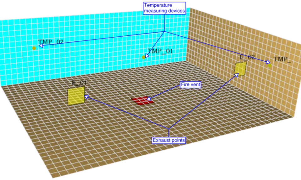
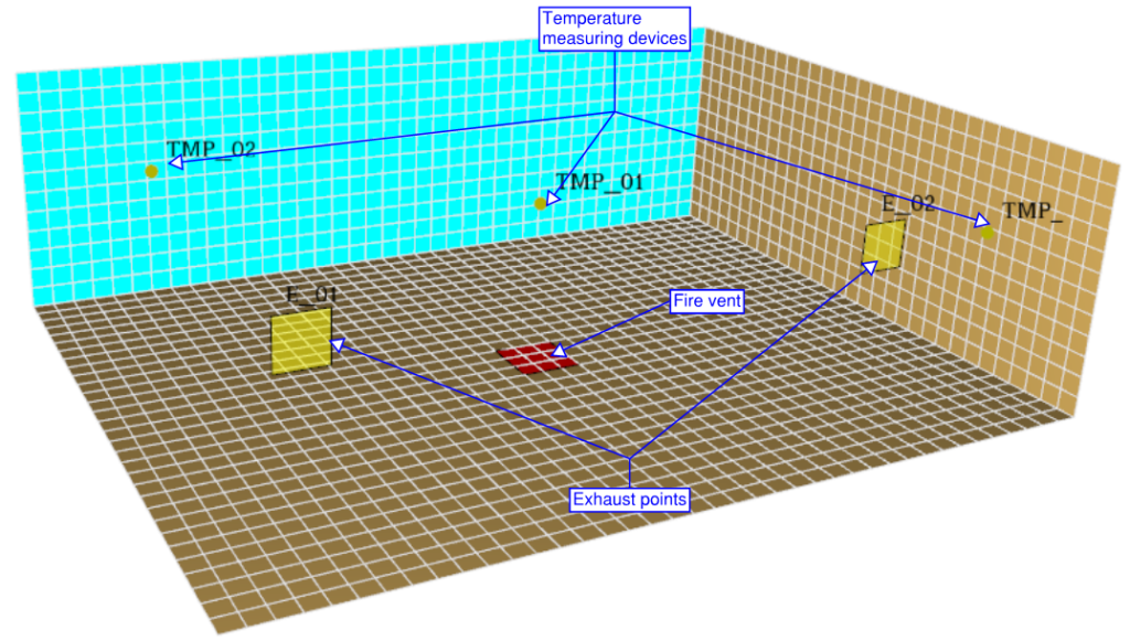
Model 2 – Generating Temperature Graph
FDS Model
Model 2 is identical to Model 1, except there are temperature measuring devices at three locations.
Python Script
The python script follows the same methodology used in the previous article to obtain a clean Dataframe.
- Step 1: Import relevant packages
import pandas as pd
import os
import matplotlib.pyplot as plt- Step 2: Import the csv file into a dataframe using Pandas
df = pd.read_csv(r'C:\OneDrive\JabirJamal.com\Fire Engineering\FE_02_DeviceData_Graph\model2\model2\model2_devc.csv')
- Step 3: Rename the column names and reset the dataframe by removing row 0.
# create a copy of the dataframe
df1 = df.copy()

# copy row 0 of df to header of df1
df1.columns=df.iloc[0]

# drop top row
df1=df1[1:].reset_index(drop=True)
df1.head()
- Step 4: Convert the data type to float
df2 = df1.astype(float)
- Step 5: Filter only temperature devices to create a new dataframe
- Method 1
This method is useful when there are a lot of devices in the model
- Method 1
# extract column names to a variable
columns = df2.columns

# filtering using device name starting with 'TMP'
temp_columns = []
for x in columns:
    if x.startswith('TMP'):
        temp_columns.append(x)

#generate a dataframe using only the filetered data
df3 = df2[temp_columns]

# create a dataframe with only time column data
df4 = df2[['Time']]

# concatenate two dataframes to form a single dataframe
df5 = pd.concat([df3, df4], axis=1)
df5
- Method 2
- This method is suitable when there are only a few devices in the model
# manually create a new dataframe with relevant info required from df2
df6 = df2[['Time','TMP_01','TMP_02','TMP_03']]
df6
- Step 6: Generate the graph using Pandas plot function and update the legends and axes with Matplotlib function.
# change working directory to the location where you would like to save the image
os.chdir(r'C:\OneDrive\JabirJamal.com\Fire Engineering\FE_02_DeviceData_Graph\model2\model2')

fig, ax = plt.subplots()

df6.plot(x='Time', y=['TMP_01','TMP_02','TMP_03'], title = 'Model 2: Temperature Graph (°C)', figsize=(7,5), ax=ax)


# label x and y axis
plt.xlabel('Time (s)')
plt.ylabel('Temperature (°C)')


# specify limits for x and y axis
plt.xlim(0,100)
plt.ylim(0,300)

ax.legend()


# specify file name for the image and generate the graph
plt.savefig('Model2_Temp.png', bbox_inches='tight')
plt.show()
Result

Github
You can download files used for this article from my Github repository here: https://github.com/jabirjamal/jabirjamal.com